آموزش طرح بندی و تکنیک های چیدمان عناصر HTML
[vc_row][vc_column][vc_column_text]
عناصر و تکنیک های چیدمان در زبان نشانه گذاری HTML
وب سایت ها اغلب محتوا را در چندین ستون (مانند یک مجله یا روزنامه) نمایش می دهند.
طرح بندی html روشی برای چیدمان صفحات وب به صورت منظم، ساختاریافته و واکنش گرا ارائه می دهد
یا می توانیم بگوییم که طرح بندی html ارائه روشی است که در آن صفحات وب چیده و مرتب شوند.
طرح بندی صفحه وب با چیدمان و آرایش عناصر ظاهری فایل html کار می کند
همچنین می توانید از چارچوب های مبتنی بر CSS و جاوا اسکریپت برای ایجاد طرح بندی برای طراحی وب سایت واکنشگرا و پویا استفاده کنید.[/vc_column_text][/vc_column][/vc_row][vc_row][vc_column][vc_separator color=”white”][vc_column_text]
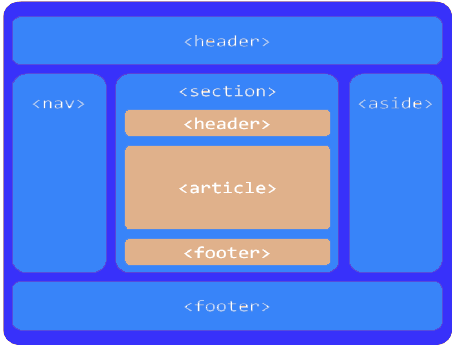
عناصر چیدمان HTML
هر وب سایت دارای طرح بندی ویژه برای نمایش محتوا به شیوه ای خاص می باشد.
در HTML عناصر متفاوتی برای تعریف قسمت های مختلف یک صفحه وب وجود دارد.
عناصر معنایی html5 را از اینجا ببینید: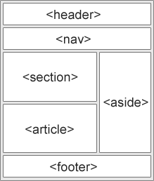
<header> – یک هدر برای یک سند یا بخش تعریف می کند
<nav> – یک ظرف برای لینک های ناوبری تعریف می کند
<section> – یک بخش را در یک سند تعریف می کند
<article> – یک مقاله به صورت مستقل را تعریف می کند
<aside> – مطالب را جدا از محتوا (مانند نوار کناری) تعریف می کند.
<footer> – یک footer برای یک سند یا یک بخش تعریف می کند
<details> – جزئیات بیشتر را تعریف می کند
<summary> – یک عنوان را برای عنصر <detail> تعریف می کند
[/vc_column_text][vc_separator color=”white”][vc_column_text]
تکنیک های چیدمان عناصر HTML
چهار تکنیک مختلف برای ایجاد طرحبندی چند ستونی وجود دارد. هر تکنیک مزایا و معایب خود را دارد:
- CSS framework
- CSS float property
- CSS flexbox
- CSS grid
1.تکنیک CSS Frameworks(فریمورک های CSS)
اگر می خواهید طرح خود را سریع ایجاد کنید، می توانید از یک چارچوب مانند W3.CSS یا Bootstrap استفاده کنید
2.تکنیک CSS Float Layout
شایع است که تمام پوسته های وب با استفاده از ویژگی شناور CSS انجام شود. شناور برای یادگیری آسان است .
شما فقط نیازدارید که به یاد داشته باشید ویژگی های float و clear چگونه کار می کنند.
معایب:عناصر شناور به جریان سند متصل هستند که ممکن است به انعطاف پذیری سایتتان آسیب بزند.
مثال
|
1 2 3 4 5 6 7 8 9 10 11 12 13 14 15 16 17 18 19 20 21 22 23 24 25 26 27 28 29 30 31 32 33 34 35 36 37 38 39 40 41 42 43 44 45 46 47 48 49 50 51 52 53 54 55 56 57 58 59 60 61 62 63 64 65 66 67 68 69 70 71 72 73 74 75 76 77 78 79 80 81 82 83 84 85 86 87 88 89 90 91 92 93 94 95 96 97 98 99 100 101 102 103 |
<!DOCTYPE html> <html lang="en"> <head> <title>CSS Template</title> <meta charset="utf-8"> <meta name="viewport" content="width=device-width, initial-scale=1"> <style> * { box-sizing: border-box; } body { font-family: Arial, Helvetica, sans-serif; } /* Style the header */ header { background-color: #666; padding: 30px; text-align: center; font-size: 35px; color: white; } /* Create two columns/boxes that floats next to each other */ nav { float: left; width: 30%; height: 300px; /* only for demonstration, should be removed */ background: #ccc; padding: 20px; } /* Style the list inside the menu */ nav ul { list-style-type: none; padding: 0; } article { float: left; padding: 20px; width: 70%; background-color: #f1f1f1; height: 300px; /* only for demonstration, should be removed */ } /* Clear floats after the columns */ section::after { content: ""; display: table; clear: both; } /* Style the footer */ footer { background-color: #777; padding: 10px; text-align: center; color: white; } /* Responsive layout - makes the two columns/boxes stack on top of each other instead of next to each other, on small screens */ @media (max-width: 600px) { nav, article { width: 100%; height: auto; } } </style> </head> <body> <h2>CSS Layout Float</h2> <p>در این مثال، ما یک هدر، دو ستون/باکس و یک پاورقی ایجاد کردهایم. در صفحه های کوچکتر، ستون ها روی هم قرار می گیرند.</p> <header> <h2>شهر ها</h2> </header> <section> <nav> <ul> <li><a href="#">لندن</a></li> <li><a href="#">پاریس</a></li> <li><a href="#">تکیو</a></li> </ul> </nav> <article> <h1>لندن</h1> <p>لندن پایتخت انگلیس است</p> <p>لندن که بر روی رودخانه تیمز قرار دارد برای دو هزار سال یک سکونتگاه بزرگ بوده است</p> </article> </section> <footer> <p>(پاورقی)Footer</p> </footer> </body> </html> |
[/vc_column_text][vc_separator color=”white”][vc_single_image image=”13746″ img_size=”full” alignment=”center”][/vc_column][/vc_row][vc_row][vc_column][vc_column_text]
3.تکنیک CSS flexbox
استفاده از flexbox تضمین می کند که زمانی که طرح بندی صفحه باید به اندازه صفحه نمایش های مختلف در دستگاههای مختلف نمایش داده شود
عناصر به صورت قابل پیش بینی رفتار می کنند و دستگاههای مختلف صفحه نمایش را در خود جای می دهند.
معایب: در IE10 و قبل از آن کار نمی کند.
مثال:
|
1 2 3 4 5 6 7 8 9 10 11 12 13 14 15 16 17 18 19 20 21 22 23 24 25 26 27 28 29 30 31 32 33 34 35 36 37 38 39 40 41 42 43 44 45 46 47 48 49 50 51 52 53 54 55 56 57 58 59 60 61 62 63 64 65 66 67 68 69 70 71 72 73 74 75 76 77 78 79 80 81 82 83 84 85 86 87 88 89 90 91 92 93 94 95 96 97 98 99 100 101 102 |
<!DOCTYPE html> <html lang="en"> <head> <title>CSS Template</title> <meta charset="utf-8"> <meta name="viewport" content="width=device-width, initial-scale=1"> <style> * { box-sizing: border-box; } body { font-family: Arial, Helvetica, sans-serif; } /* Style the header */ header { background-color: #666; padding: 30px; text-align: center; font-size: 35px; color: white; } /* Container for flexboxes */ section { display: -webkit-flex; display: flex; } /* Style the navigation menu */ nav { -webkit-flex: 1; -ms-flex: 1; flex: 1; background: #ccc; padding: 20px; } /* Style the list inside the menu */ nav ul { list-style-type: none; padding: 0; } /* Style the content */ article { -webkit-flex: 3; -ms-flex: 3; flex: 3; background-color: #f1f1f1; padding: 10px; } /* Style the footer */ footer { background-color: #777; padding: 10px; text-align: center; color: white; } /* Responsive layout - makes the menu and the content (inside the section) sit on top of each other instead of next to each other */ @media (max-width: 600px) { section { -webkit-flex-direction: column; flex-direction: column; } } </style> </head> <body> <h2>CSS Layout Flexbox</h2> <header> <h2>شهر ها</h2> </header> <section> <nav> <ul> <li><a href="#">لندن</a></li> <li><a href="#">پاریس</a></li> <li><a href="#">توکیو</a></li> </ul> </nav> <article> <h1>لندن</h1> <p>لندن که بر روی رودخانه تیمز قرار دارد برای دو هزار سال یک سکونتگاه بزرگ بوده است</p> </article> </section> <footer> <p>Footer</p> </footer> </body> </html> |
[/vc_column_text][vc_single_image image=”13743″ img_size=”full” alignment=”center”][/vc_column][/vc_row][vc_row][vc_column][vc_column_text]
CSS Grid Layout
ماژول طرحبندی شبکهای CSS یک سیستم طرحبندی مبتنی بر شبکه، با ردیفها و ستونها را ارائه میدهد که طراحی صفحات وب را بدون نیاز
به استفاده از شناورها و موقعیتیابی آسانتر میکند.
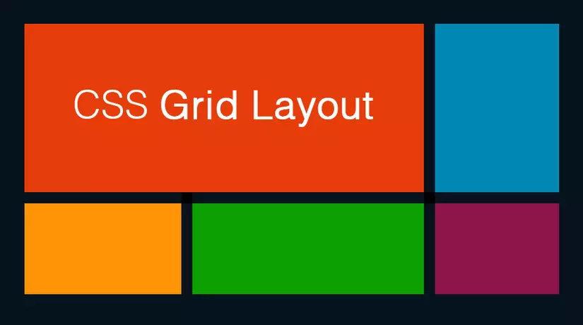
در مقالات آینده بیشتر در این مورد صحبت خواهیم کرد.
به پایان یکی از آموزش های HTML رسیدیم از وقتی که گذاشته اید سپاس گزاریم.
[/vc_column_text][/vc_column][/vc_row]

